LOGO REDESIGN
The Challenge
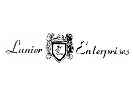
Lanier Enterprises, a locally owned small business specializing in irrigation, was in need of a logo update to refreshen their brand. The original logo had personified Lanier Enterprises since the company’s inception in . Representative of the owner’s family crest, the client wanted to maintain that aspect of the logo. It represented the family-owned aspect of the business, which was an important part of their brand.The Solution
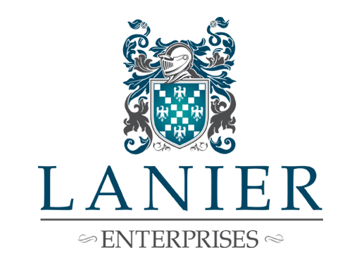
Instead of a complete redesign, Design Wheelz recreated the family crest and developed a new, refreshed logo with the crest as the feature element. By choosing colors significant to the client’s industry and an updated, crisp font, the new logo design has a fresh and clean look, while exemplifying the quality, loyalty, and professionalism indicative of the company.Before
After

Specs
Revisions
Day Turnaround
Amazing Result
PROGRAMS USED


Adobe Illustrator
- Illustrator 100%
BUILDING THE BRAND
A New Functional Logo
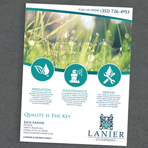
A solid logo and the introduction of a new color palette opened the door for a brand new look and feel for the company’s brand.
